Loading Selected Work...
Menu

From Whence Subject Matter?


I teach a class on March Mondays for a group of painters in South Orange County, California. They meet every Monday morning and have a different teacher for each of the months that they meet. They are an uncommonly welcoming and wonderful group – eager for new experiences, new approaches and they treasure their time together.
I have taught, nudged and watched them over the past 5 years during our month together and this last week talked “turkey” to them. It was done with love and concern for their growth as artists but let’s face it, that sort of conversation is fraught with peril. To my delight and thankfulness, they took what I said to heart and thanked me for my candor. What did I say?
Number one, I reiterated my cautionary comments of last year when I told them that by receiving so many views, so often from a group of instructors was tricky business. Having space between and ample time to work is optimum. They then have a chance to take what makes sense for their own work and release that information that does not. Lacking that, they needed to be very choosy about what they chose to include in each teacher’s offerings. Most of these folks paint on Mondays only, which complicates growth by itself.
Then I shared my observation that most of the group used source material from others, whether it was sketches or photos or magazine photographs, the common occurrence was the use of material that was not their own. There is nothing wrong with using other resources as long as permission is granted or if the image is only a jumping off spot for a new work. But too often, the painters were copying someone else’s composition, color choices, value patterns, etc. All the important decisions are made. We have “no skin in the game” if we choose another’s viewpoint. Working from the work of others is fine if it is for the purpose of learning but the issue of copyright looms if the work is a copy of another work and then is offered for sale. Drawing and interpreting is much easier and more pleasurable if the subject has meaning to the artist.
The above is especially true of artists finding their way to their own voice as painters. Subject matter that is familiar and enjoyed frees the artists to “play” with new approaches, color schemes, compositional motifs, etc. With their enthusiastic reception of my comments, I am optimistic and looking forward to see what they do in the future.  

Drawing & Painting and Learning about them

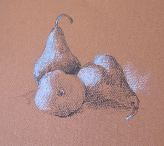
Pears drawn with pencil, white charcoal pencil on pastel paper

If you wanted to learn a new skill, what would you do? Take a class? Go to the library? Look for online classes? Of course! Would you expect to know all about the subject matter before teaching began? Of course not!
Why then do people expect to know how to draw or paint before the first class? I’ve had students “practice” before class because they didn’t want to look stupid. Others talk about not having “talent” so they won’t venture to try. Quite a few of my junior high students would say upon entering the classroom, “No one in my family can draw a straight line without a ruler.”
My responses in order: If you’re supposed to know all about a class before the first meeting, what exactly is my role? If you think that you have to be imbued with TALENT to participate, please read my earlier blog, “Who gets the Creative Gene?” And about rulers and straight lines? I told the kids that straight lines were boring so they would be fine.
For this blog, I’ll confine my comments to drawing and how I approach it. Here is the deal, drawing is not magic, nor is it limited to those talented few. It is a learned skill that can provide years of enjoyment with limited materials and reasonable cost. The more you draw the better you will be. That is a certainty.
When you first begin to draw, do yourself a favor and look for subject matter that fits these three criteria – choose a simple shape; pick a familiar form; draw from life, not a photo. By beginning with a simple, recognizable shape, you go far in establishing a sucessful drawing experience. Once you master simple shapes, more complex ones will seem easier to tackle. By drawing from life, you can touch and smell as well as see your subject. The opportunity to look at various positions and views allows you to choose the most pleasing to you. Photographs do not allow this intense scrutiny and the varying angles are not available. Being familiar with your subject is a real bonus when drawing. If you work with shapes you have seen for years you don’t have to spend time learning unusual aspects of your subject.
The drawing described here will be natural forms. I have illustrated the pear for the examples shown but you can just apply these suggestions to another still life subject. I used two different pears, a Bartlett and a Bosc. There is nothing special about my choice as many would suffice, but I find the pear shape to be beautiful and graceful, hence the choice.

DRAWING CONTOURS
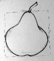
The contour of a shape describes the edge of form. Think of the shape as a silhouette – you will draw the edge of that silhouette. Learning to do a contour drawing is essential for painting. Often I am attracted to a subject but until I do a simple contour drawing, adjusting the image to my liking, I don’t really know if it will work. Often I do several of these small thumbnail drawings to see what arrangement is the best.

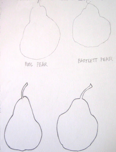
Top row: Blind Contour  Bottom row: Pure Contour


When you are first beginning to draw, the blind contour will encourage your close attention. This is all about training your hand to draw what your eye sees. Place your pencil on the paper and draw the contour without again looking at your paper until you have finished the form. This is not a race and you’ll be more observant if you go slowly and carefully. Don’t worry if the drawing is a bit wacky – you’re goal is to really, truly look at the shape.
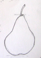
Pure Contour: Draw the same object you used for the first exercise. This time, place your pencil on the paper and draw the shape while looking back and forth as much as needed. Go slowly and keep your pencil firmly on the page. The line should be continuous and not sketchy.

Bartlett Pear

Bosc Pear

The Bartlett pear (above) was just about as wide as it was tall. When I measured with my pencil I compared the height to the width. In this case the measurement was very similar however that may not always be the case. The Bosc pear was about 1 1/3 times taller than it was wide. Notice the slope of the “shoulder” of the fruit. After you have an accurate contour drawing, which should do much to describe your subject, you may begin to add shading or value.
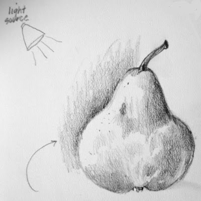
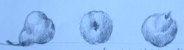
ADDING SHADOWS


The addition of shadows will change your flat contour drawing into a seemingly 3-dimensional object. To see the shadows, shine a light on the subject to create a shadowed side. An old desk lamp will do but you do need a light fairly close to the subject so sharp contrasts are visible. To enhance your observation, squint your eyes almost shut and the darks and lights will be obvious. By adjusting the pressure on the pencil lead, a range of values, or grays, can be created. Add the details of stem, bud end, bruises and texture as needed.
By shadowing the background on the light side of the pear, it appears lighter and stands out from the background.

After I drew the pear from one angle, I went on to draw it from other views. Once you get to know a shape, draw it several times. Put that knowledge to use.

Remember, drawing is not magic. Anyone can do it with a bit of direction and time to practice. This is something you can enjoy for your entire life. The more drawing you do, the more observant you become and more skilled at replicating your subject. Now go out there and discover the wonderful, beautiful world – you will see it in a whole new way!

Watercolor Musings: The Value of Asking “What If”

Watercolor Musings: The Value of Asking “What If”:         …and the importance of building personal scaffolds Early Bak ersfield School House  Recently I had a fascinating conver…

The Value of Asking “What If”

        …and the importance of building personal scaffolds


Early Bakersfield School House

Recently I had a fascinating conversation with my sister who after retiring from the classroom is presenting at conferences for teachers.  We come from a long line of educators going back to our grandfather who graduated from Bowdoin College in Maine in 1900 and after being a teacher and principal finished his career as Superintendent of Schools in Redlands California. Most of our family’s four generations of educators taught in grades K-6, but since my credential was a Special Secondary in Art, I had a different group of classes than those teaching elementary school. As my sister was describing her new training, she also mentioned “scaffolding,” a term I was unfamiliar with in the classroom setting.  She said it’s the concept of the teacher presenting material just a bit ahead of each student’s level, encouraging growth smoothly from one building block to another.

Well, I didn’t recognize the term in this context, but the concept was utterly familiar. I have been doing that in my artwork for years by giving myself problems to solve, asking “what if“ regarding working processes and trying out new materials or using old materials in a completely new way.  I also find that conversations with fellow artists who share your curiosity helps create even more “what ifs.”

Some favorite supplies

Robert E Wood, a fine watercolorist and teacher gave one of the best pieces of advice I’ve ever gotten from a workshop leader. He admonished us to keep ourselves on the edge of comfort, approaching discomfort, to refrain from painting the “same painting over and over.” By focusing on a few goals to solve in the creative process, the learning expands and quality improves because the artist is actively solving problems rather than painting “pretty pictures.”

All artists recognize that “itchy” feeling that foretells a growth spurt in your work. Not an especially comfortable feeling since you have to figure out what it is that you want to change and where it is that you are heading. And to go from comfort and confidence into the great unknown takes its own kind of courage. But it also brings excitement and anticipation and joy, which is why we keep at it.
My sister commented that one of the real losses in schools is the growing absence of art and music in the curriculum. The students lose the chance to interact with instructors who automatically think in the “what ifs.” I distinctly remember a class of seventh graders who were instantly engaged when I described a method that I’d been thinking about but had never taught before. I asked if they’d like to try it. It was an overwhelming success and they dove into the work with great enthusiasm. All of us had a wonderful time.
As an educator, I am committed to arts education and it’s importance in the curriculum. As an artist, I’m convinced that we all need to build our own scaffolds for life long learning. May your New Year be full of engaging and challenging scaffolds!  

Watercolor Musings: Learning from Robert E. Wood

Watercolor Musings: Learning from Robert E. Wood: Robert E. Wood (1926-1999) was known for his watercolor landscapes,  marine paintings and figures in a semi-abstract style.  He earned …

Learning from Robert E. Wood

Robert E. Wood (1926-1999) was known for his watercolor landscapes,  marine paintings and figures in a semi-abstract style.  He earned a B.A. from Pomona College and an MFA from Claremont where he studied with Millard Sheets, Phil Dike and Jean Ames. He was elected to the National Academy.
Taxco by Robert E. Wood  
I was so fortunate to take several workshops from him and in fact met him and visited his studio while I was in college. His nephew, Ron Wood, was a classmate of mine and he arranged our visit. During the workshops, I took notes and several years ago I gathered up those sketchbooks and arranged his advice in categories. These have been helpful to me and I hope they will be to you too.
Figure by Robert E. Wood
Bob Wood on Shadows
• Be aware of the character of form and volume. Look for the shadow shape.
• Softening the edges of 2 vertical, parallel lines rounds form. It turns the area into a tube.
• Shadows are not equal in width – they are thick, thin, etc. 
• Shadows are not repeats of the border or the edge of form.
• Cast shadows are hard-edged while form has a rounded edge.
• Look for shadow linkage – where it goes through edges. Too often we stop at every edge without seeing the passage of shadows.
• Shadows blanket a group of things.
• Recreating light exactly can create a “jumpy” painting. Try to simplify the darks so they are more clearly stated, made more understandable. 
Bob Wood on Color and Value
• Attempt to take fewer steps from light to dark.
• First washes appear dark because of the comparison to the white page.
• Make a value plan of 3-5 steps. The painting will always be more complicated than the plan. 
• Most painters are good colorists in the lights. In the middle values they start to be a little less color conscious and the darks are boring. Bring life to the darks. 
• Paste is not as luminous as a thinned liquid dark.
• The first application is never a dark – layering is what causes the darks. Start with a moist color so the paste on top of moist color will dry more “liquid.”
• Use a complete palette to create a greater variety of darks. 
• Several little paintings can explore different color moods which is more effective than one large painting. 
• Be sure the drawing is dark enough to see so the first wash doesn’t obliterate it.

Learning from Millard Sheets

Mosaic by Millard Sheets in the former Home Savings and Loan Tower in Pomona

I was extremely fortunate to study with Millard Sheets in his final two workshops. I kept copious notes and from them extracted tips and admonitions on color and value. These have been very helpful for me and I’m happy to pass them along.

  • Before you begin, determine where the light starts and stops.
  • Establish the lightest light and darkest dark early.
  • Worry about shadows on objects later – get the basic value down first.
  • Give it hell from the minute you start painting! There is no point covering up pale washes when the object is essentially dark.
  • You never get a color by looking at it alone, only by relationships. Don’t look at isolated items, look back and forth 4 times. Which is lightest? Darkest? Warmest? Coolest?
  • Always work from colors in the same family. Compare whites against whites, blues against blues, etc.
  • The greatest colorists in the world are the ones who know the most about muddy color. Mud can be a foil for brilliant color. 
  • Put the purest, brightest color in first. It’s too hard to get pure color later.
  • Warm colors always have more weight than cool colors.
  • Cool colors suggest atmosphere.
  • Generally speaking, the color will come in the half tones, not the lightest tones. 
  • Don’t be afraid of color, it makes a painting rich.
  • Anytime two colors are repeated in the same area, it becomes the same place. Don’t have a lazy brush. 
  • Color, to become a miracle, has to be felt. Take time to see it.

Watercolor Musings: Mom Was Right, Say Thank You

Watercolor Musings: Mom Was Right, Say Thank You:   It was the best car my 8-year-old self could have wished for…a 1949 Ford Convertible in yellow! The first of only two new cars my …

Mom Was Right, Say Thank You


It was the best car my 8-year-old self could have wished for…a 1949 Ford Convertible in yellow! The first of only two new cars my parents would purchase in their lives. We took it to the beach with the top down and that made the whole experience even more special. My Mom would make each of us two sandwiches apiece…one for lunch and the other to eat on the way home after we’d worn ourselves out in the ocean. I remember sand-gritty hands, wet hair and towel wrapped body in the back seat, being windblown and loving every moment.
What I couldn’t have realized then was that the most memorable and significant part of that time was the monthly issue of the FORD TIMES that was sent to all customers. In that wonderful little magazine, which was published to encourage car trips in the United States, were watercolors of all the places and scenery being highlighted in each issue. I remember pouring over each installment looking at each painting. I firmly believe that began my passion for the medium that has only grown over time, both as a painter and a collector. My favorite paintings were those done by Rex Brandt and truthfully those were the only ones I remembered until I purchased some issues online a few years ago. 
FORD TIMES – January 1953, June 1956, April 1957
So, what does this all have to do with Mom and saying thank you? Several years ago I was asked about my early interest in painting watercolors and after mulling that question over a bit, I remembered those paintings in the FORD TIMES.
After remembering, I thought it was necessary to say thank you to Rex Brandt who was so influential for me. I’d had two good chances to say something when I took two workshops from him in the 1980s and I was sorry I hadn’t, but I hadn’t put it all together then. I was in the midst of raising small children and felt lucky to carve out a week to go painting!
At last I wrote a note, telling him about my early interest and how I’d learned about him, my subsequent schooling and teaching and finally my current situation – painting, teaching and having a gallery specializing in water media. I told him I thought it was high time I send him my gratitude for his influence on my life. 
Two to three days later, I saw his obituary in the newspaper. My heart sank! I had waited too long. A week later I got a letter from his daughter, Joan. A brief note on the back of the service folder read: “I read your letter to dad on the day is died. He was pleased and so was I. We will miss him.”
Don’t wait too long. I almost did.

Watercolor Musings: Benefits for New Painters – Ink & Watercolor

Watercolor Musings: Benefits for New Painters – Ink & Watercolor: Old Oak, Paso Robles  All the images in this post were published in “Work Small, Learn Big!” published in 2003 by International…

Benefits for New Painters – Ink & Watercolor

Old Oak, Paso Robles
 All the images in this post were published in “Work Small, Learn Big!” published in 2003 by International Artist. The work was done on 9×12 handmade watercolor paper, drawn with a rollerball pen, medium point and painted with watercolors. 


The Courtyard, Orange
A number of years ago I was privileged to be asked to write a chapter for International Artists’ Magazines book, “Work Small, Learn Big!” I was one of 17 artists from English speaking countries to do so. It turned out to be a fascinating collection of all sorts of  methods using these basic tools. After teaching this technique to many students throughout the years, I’ve noticed several exciting benefits to beginners.
Vine Street Victorians, Paso Robles

It keeps you focused. By working quickly, you’ll be more inclined to concentrate on big shapes and really, truly observe the environment.

It makes you practice drawing. Starting with pen, not pencil, is a huge boost. Unable to second guess yourself once the pen touches the paper, you’ll keep drawing even though corrections need to be made along the way.

It helps you get over perfectionism. When the waterolor is added, some of the drawing lines are blurred so “making it perfect” is no longer a concern.


Coffee Corner, Orange
It encourages you to work outdoors. There is relative anonymity in this approach. With a chair or stool placed against a wall, you become somewhat invisible to passersby, removing the likelihood of over-the-shoulder viewers.
It keeps you on task. Demanding that the work be completed in a defined time frame is a sure defense against procrastination.

It builds confidence quickly. The more you do the better you get, period. And that leads to more work which, in turn, gets better and better.

It reduces your stress level. It’s the kind of fun that takes complete concerntration. You can’t worry about anything when you’re so happily engaged in painting.

It keeps you young by engaging the mind and body and teaching you to see the world differently. And the decision making that must be done as you work exercises the brain. I’ve always thought that Ponce de Leon, that seeker of the fountain of youth, had it half right. Not only water is necessary, but so in paint!

Watercolor Musings: Who gets the “Creative Gene?”

Watercolor Musings: Who gets the “Creative Gene?”: Santa Barbara Mission in pencil and paint. I suspect my affinity for watercolor has lots to do with my love of drawing. I began drawing at…

Who gets the “Creative Gene?”

Santa Barbara Mission in pencil and paint. I suspect my affinity for watercolor has lots to do with my love of drawing. I began drawing at a very young age and it has always been a source of enjoyment and comfort for me. Because of that, I’ve drawn constantly on any paper available at the time. All that practice, even though I did not consider it such, has built my skills as a result.     
I find it interesting to hear people profess their lack of artistic ability so readily. When I ask how many classes they have taken, almost always I hear, “None” or “Not since childhood.” When a talented pianist signed up for a beginning watercolor class with me I found out on the first day that she had practiced for 2 weeks prior so she wouldn’t look ignorant. I asked her if she’d done that with piano lessons and of course she shook her head. Somehow it is believed that “Talent,” with a capital “T” is the reason some can paint, or draw or create. Furthermore you should be able to do all of it well with no training at all.
This is easily observed in the elementary classroom. The children somehow assign the title of “artist” to one of their peers and then back away as if they should not excel themselves. The assigned artist accepts the title happily. On the day I demonstrated for my sister’s 2nd grade classroom, I watched the interaction of the children when I gave them an assignment. When I complimented others than the chosen artist, they were tickled but the boy who considered himself the only artist in the room got a grumpy face. Sadly, the community at large believes that at birth some are given the “creative gene” while others are not and that’s the end of it.
Sorry…wrong! Drawing and painting and design proficiency are gained the way all other disciplines are…by work and repetition and tenacity. Are some more inclined to do art? Probably. Just as some are more inclined in other areas it is true here. That interest and inclination or encouragement lead to practice that is completely enjoyable. And practice leads to competency. Simple as that.
I knew this internally and then stumbled upon an article published in Fortune on CNNMoney.com. Geoffrey Colvin wrote about, “What It Takes To Be Great.” I have read portions to countless classes and watched their self-inflicted boundaries expand.
The article can still be accessed on the Internet by typing in the title and author’s name. It explains the scientific study behind the conclusion that targeted natural gifts don’t exist. Nobody is great without work. It is a fascinating article well worth the time it takes to read. And it is encouraging to those of us who will never be “great” but want to expand our horizons with the time we have.
I always think of Dwight Strong, my friend who began painting at 69 years and became such a wonderful painter that when he died in his mid-80s, he left a huge body of work. And this work was collected by some of the artists whose workshops he had taken. He was single-minded and focused on his goal. One time he told me that he had taken 50 workshops. When I exclaimed over the number he told me, “Judy, I don’t have any time to waste!” I am fortunate to own several of his paintings.

Watercolor Musings: Designing Images with Meaning – II

Watercolor Musings: Designing Images with Meaning – II: This is a continuation of the initial blog about designing images with meaning. These creative problems are fun to do and I usuall y “thro…

Designing Images with Meaning – II

This is a continuation of the initial blog about designing images with meaning, in this case those created for the Orange Public Library History Walk. These creative problems are fun to do and I usually “throw” the requirements in the back of my head and let it simmer for awhile. The idea of the images was to tell the story of the city of Orange within images and a brief text by Phil Brigandi. The following are the stories of the railroad, citrus industry and agriculture that was NOT citrus. 

The Railroad
The composition of this particular painting gave me a bit of trouble. The positioning of the buildings represents the existing 1930’s era station in the foreground and the Victorian station in the rear or in the past. I learned that in actuality the Victorian station was to the south or to the right of the current station. If you visit the station you can see the space between the trees and the buildings. I tried several times to make the composition accurate by having the Victorian Station in the foreground. It just wouldn’t work so I finally returned to my first thought.The railroads had a huge impact on the settling of the west so this was an important part of the story to be told. 

While designing this painting a real serendipity occurred. I was speaking wishfully about the image of the train stations and the possibility of having an old train ticket to help as a transition between the old and new stations. Not two days later, Bobby McDearmon came in the gallery and asked me if I’d like to have an old ticket to use as reference…it seems he was talking to Lisa Ackerman, a friend and shop keeper around the corner and she had been here when I was verbalizing my wish. He specializes in historical ephemera and has an extensive collection that is Orange based. The rail ticket he loaned me for this piece was issued August 1, 1892.

The Citrus Industry
Whereas there was a dearth of information and images for some of the paintings, this subject was so rich in material that my job was to make the difficult decision of what to include. Since the Santiago Packing House was at one time the largest Valencia packing plant in the world, their label became the largest image in the painting. Choosing a packinghouse proved not only difficult but rather uninteresting shape-wise. The truck became a representation of all the packinghouses, was interesting and color-wise was a real addition once I found out what color this old truck was. Pictures for this project were almost all in black and white so I called on friends with expertise when needed. The grove, fading off into the distance filled the outer areas of the piece and lugs of oranges with the addition of a picking sack filled the lower left hand corner nicely. This composition has some personal meaning since I grew up on groves in San Diego County and was well acquainted with the equipment. And adding to that connection, my neighbor for many years was President of the Santiago Packing House.
Early Agriculture
Agriculture and animal husbandry that was not citrus is the theme for this image. A tall vine of grapes frames the painting, which includes apricots, walnuts, avocados, grain, chickens, row crops, dairy cows and pumpkins. The pumpkins were a late addition. I had purchased a new book of Orange Place Names by Phil Brigandi just before I began the paintings. At one time West Orange was called “Pumpkinville” by the residents. I needed another warm color and decided to include the fall squashes. 
As I said in the first blog on these images, they are part of placques outside part of the perimeter of the library building. People need to be able to grasp the meaning of the image and have time to read the brief history also on the placque. All the original paintings are framed and on the second floor of the library next to the history room.