PAINTING ON LOCATION
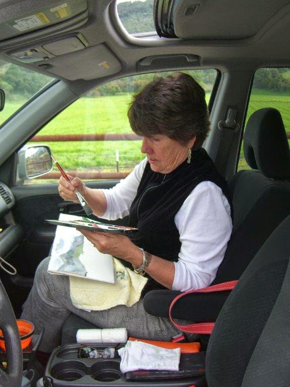
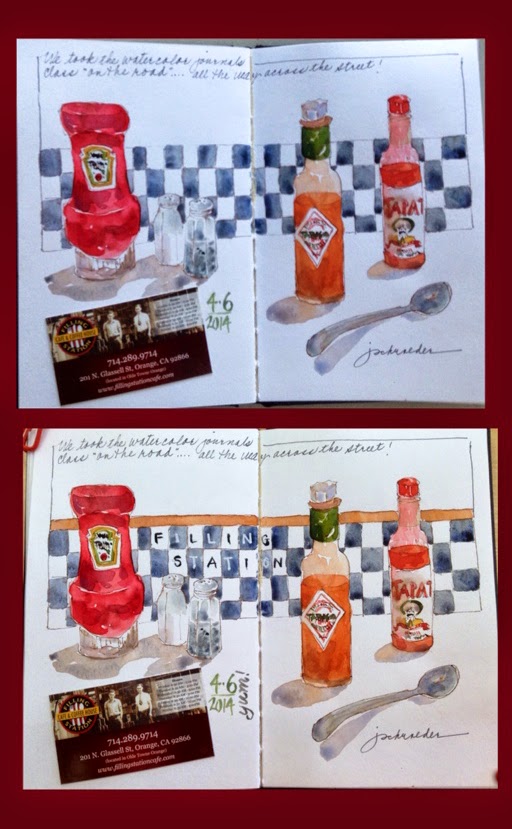
Painting “en plein air” or “on location” or my personal favorite “paintabout” is a sure-fired way to recharge your artistic spirit. Is it easy? Oh, no. Is it worth it? Oh, yes! The more you do it, the easier it is to get to cruising speed in your work. If it’s been awhile, the first few attempts are usually, well, uninspired. That is why I urge my students to make a habit of painting on location at least once a week and also to grant themselves several days away once or twice a year to plunge into painting whether it be a workshop or a getaway with a painter friend. Having the luxury to think only about the process of painting is a sure fired way to advance in your work and you bring home ideas for additional paintings.
However, sometimes painting on location can be “interesting,” to say the least.
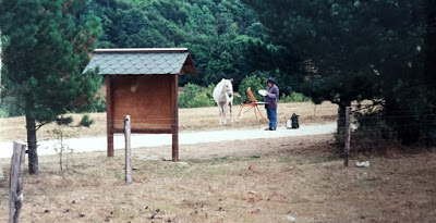
Painting trips can encompass all the range of emotions imaginable – elation, sadness, fear, delight, amusement and so on. This was the case on a trip that began in Italy and finished up in France. The Drome is an area of southern France that was the home of a couple who ran an art and cooking school. The timing of my visit was memorable, sadly so. I had been in Verona, Italy and during our stay, the twin towers in New York City were bombed. It was difficult to contact family at home and I was disappointed in myself that my memory of important things was definitely interrupted by emotion. Fortunately I went to an internet cafe and the owner was a young man who trained at Art Center in Pasadena. I was able to check in with family and a few days later proceeded to the second part of my trip to France. The day I was painting in Comps, we chose an ancient chapel located in the countryside with no buildings nearby. The wind was blowing and the temperature dropping as I began a painting. I had chosen a spot next to a row of trees to shield me from the wind and there was pasture nearby. Pretty soon a couple of horses strolled over and seemed interested in my activity. After I had drawn and put in the first wash, I looked over my shoulder and my former admirers were sound asleep. There are critics everywhere!
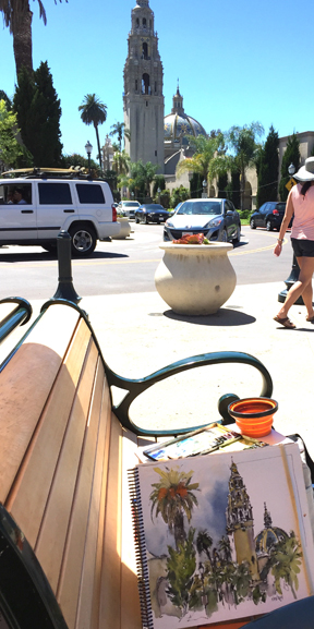
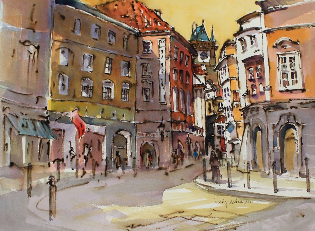
Going to places that are new brings an excitement that is translated into your work. And because you pause and paint, you are regarded as more than just a tourist. It’s important to find a way to work that makes you comfortable and still makes you open to new experiences. If you don’t want people to peer over your shoulder, then back up to a building or bushes. Get out of the line of sight by sitting on a stool and you’ll be surprised how many people just walk right by. You can also wear earplugs, as if you are listening to music and most will not bother you. As you gain experience, these pauses won’t bother you but it’s important to protect yourself as you embark on this very public way of working. Sketching in a journal which can be closed if people come too close works well too. Just remember that the reason for the interest is that they are absolutely fascinated by what you do and impressed with the results.
Working on location, or en plein air, is a wonderful way to get out into our wonderful world and record your unique perspective. Later as you review your paintings and/or sketches, you’ll be astonished how the sounds, conversations and fragrances of the time you did the painting come flooding back as you view the images. Magic! Don’t miss it!