

 |
|||
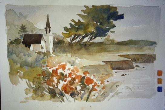
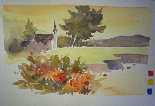
| Mendocino Church – Ink and Watercolor – 15″x22″ |
This painting was the prompt for several exercises in color combinations. I was experimenting mostly with versions of the primary triad. The one above was done with a full palette of color added after the initial ink brush drawing. It was done on site and I did not exaggerate the roses in the foreground. During the time I was painting the fog rolled in and out, the sun played peek-a-boo and things generally changed every few minutes. Some of that memory will be explored in the following paintings.
 |
||
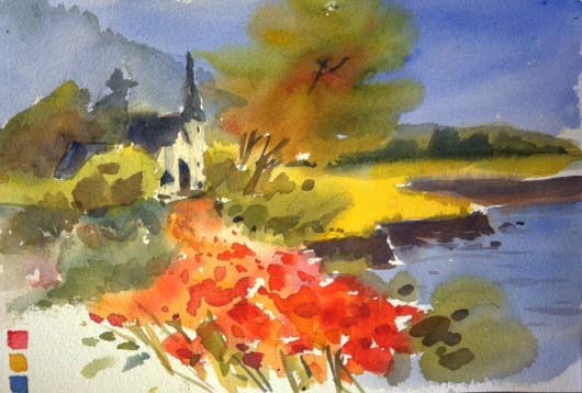
| #1 – Ultramarine blue/yellow ochre/burnt sienna |
Each of the study paintings were done in a small format – 7.5″x11″. When you are exploring it makes no sense to work in a large format. These are large enough to see what the color combinations can do but not so large as to be too time consuming. None of them are meant to be finished or to be presented for sale. They are just for my own use in teaching. The combination above is the one used by the California School painters when they worked on location. They are somewhat subdued.
 |
||
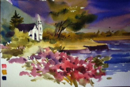
| #2 – Brights – Quinacridone coral/new gamboge/cobalt blue |
The brights used here create a very different feeling compared to the first example. I purposely left them in their hue, graying them only for the mountains in the background. Each sample took about 10 minutes. I drew and painted them quickly. Again, the purpose was to see what the limited palettes could do.
 |
| #3 – Quinacridone rose/quin. gold/ultramarine blue |
The colors are cooler and the paint was applied wet into wet. The sky was dark making the forground plateau lighter. As the paper dried, the paint had a harder edge. Notice the pine tree behind the roof of the church.
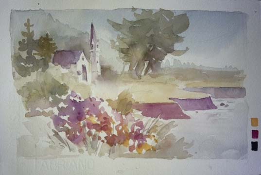 |
| #4 – Quinacridone gold/quinacridone magenta/indigo |
This was the most surprising combination of all. I expected to dislike it and yet found I quite liked the tones it created. I left the color soft and light to emulate fog or early morning haze.
 |
| #5 – Scarlet lake/azo yellow/cobalt blue |
Here is a different version of brights. No emphasis on the water here as it looks almost flat. By using the same subject and composition you can really evaluate the colors. I did some other small exercises with the emphasis on different elements such as the church, the pine trees, the water and cliffs, etc.
 |
| #6 – Quin gold/quin sienna/cerulean blue |
A sequential series of washes was done before the images were painted. A full layer of each of the colors in the triad were put one after another while the former was still wet. If you use this technique be aware that the last color applied will be dominant. After the underpainting is completely dry, the rest is painted. You can also wipe out any area you want to be lighter before the underpainting is dry which will change it yet again.
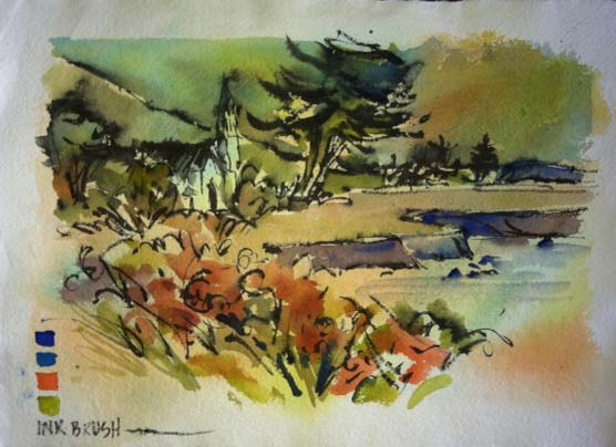 |
| #7 – Ultramarine blue/cobalt blue/permanent orange/green gold/black ink brush |
In the initial painting, the ink was first. In this one, the ink was last but put on before the watercolor was absolutely dry. Different colors and different methods yield a completely different result.
Any series such as this can be very illuminating. All sorts of explorations can be done and by using an initial painting you have the advantage of having drawn it before. Each subsequent drawing will be easier and faster to do.