Loading Selected Work...
Menu

Watercolor Musings: Designing within Different Shapes

Watercolor Musings: Designing within Different Shapes: One year ago I was on Monhegan Island, off Maine’s coast, with 6 students. It has been a place for artists for more years than I know and th…

Designing within Different Shapes

One year ago I was on Monhegan Island, off Maine’s coast, with 6 students. It has been a place for artists for more years than I know and the scenery deserves this attention. We were there for a week and painted in many different places, found the market where fresh, hot, cinnamon sugar donuts were sold at 7am, ate lobster and lobster and lobster. I also ate mussels but didn’t have others join me in that meal.

Perhaps my favorite view was of a lobster shack we frequented often for both inspiration and food. The first image is the more traditional rectangle. The focal point is the red umbrella which is the tiny lobster shack and the large building on the right side frames that portion and pushes the viewer into the picture plane. Both paintings were done on location and drawn with a color brush in sepia prior to the addition of watercolor.

Lobster Shack  12″x16″

The second painting from this spot is a long horizontal. It shows much more of the waterline and the many homes along it. Because of that, it is a longer, more distant view. It also looks as if it was a sunny day because of the vibrant color and calmer sky. We had all kinds of weather when we were there – sunny, blustery, rainy, foggy, misty, etc.

Monhegan Panorama  8″x19.5″

I enjoy doing the same subject matter in different ways. By designing in different shapes, you get a chance to solve more compositional problems and avoid doing the same painting over and over. The advantages of working with familiar subject matter is obvious…what you know you can draw more quickly and accurately.

I think I may try this again in a square format and a really blustery, rainy day. That would be fun!

Watercolor Musings: More Than a Painting Trip

Watercolor Musings: More Than a Painting Trip: A typical fruit stand in Western Samoa

In May 2000, I traveled with another artist to Western Samoa. It was to be a 2 week trip …

More Than a Painting Trip

A typical fruit stand in Western Samoa
 In May 2000, I traveled with another artist to Western Samoa. It was to be a 2 week trip but my artist friend, Lucy, had to return home since her house had sold and she needed to attend to necessary business. That meant that I was alone the second week as there was not an airline seat available and only two flights a week go to Apia, the capital.
Being by myself meant that I did more visiting with the people there and I learned some very interesting things – about my own country.
During that first week we met Ray, a taxi driver, who took us to those areas out of our walking range. So for the second week, I set up several days so Ray could take me to some of the more out of the way places. One day we drove around the entire island and we had time for a long visit.
Ray was a very ambitious man. He had 3 taxis, a rental business in machinery and was getting ready to expand his rental business to party supply. In contrast, a young man who visited with us when we first arrived was trying to find a way to gather more money in addition to his regular job. He had asked Lucy for a loan and when she asked him what he could do to earn some extra he said he could fish. Well, everyone fishes there and fish are available all over the island.
The home or fale (fall-ay) of the matai on tiny Monono Island.  
Ray was a huge contrast to that line of thought, looking for ways to provide a service that was unusual and needed. He told me that his ideas were as a result of living in Hawaii and Los Angeles for a few years. That exposure to entrepreneurship in the United States was the catalyst for his work back in Samoa. He was so successful that his father-in-law asked him to assume the title of Matai or high chief of the large extended family. That was a huge compliment as the Matai is handed down to either a man or woman according to the family line and they are responsible for the financial health of the family and well as the one to mete out necessary discipline. That discipline even extends to being sure that the family members take good care of their property.  Ray told me he was flattered but wanted to do for his own family before he took on the responsibility for the whole extended family.
I realized how much we take for granted because of our childhood environment. Perhaps we may be too critical when judging other cultures because of our assumption that they have the same opportunities. I had two examples of young men – one with a limited view on how to achieve his goals and the other who because of his travel had a clear idea of his path to financial independence.

This was one of the more fascinating and unusual painting trips I have taken. 

Travel Journals

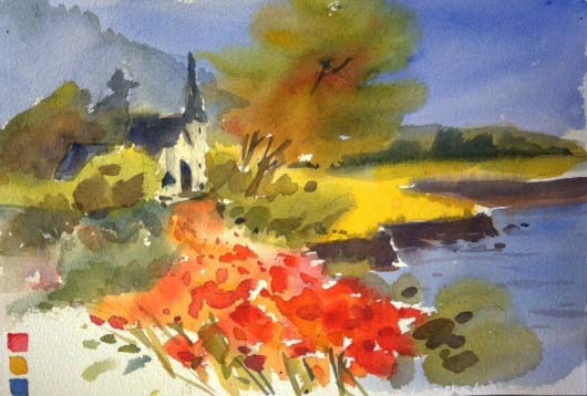
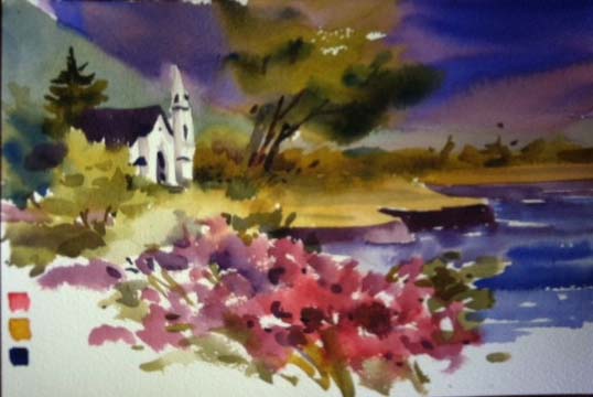
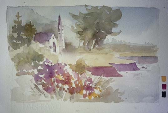
 Taking a sketchbook along on travels, near and far, is a super way to build powerful memories. Added to that is your ability to be entrtained and patient when the inevitable interruptions occur. Here are pages selected from journals going back over 25 years. 

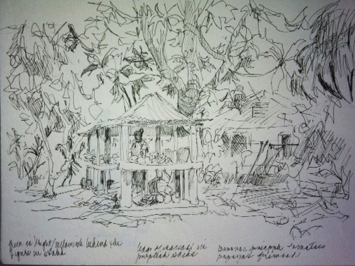
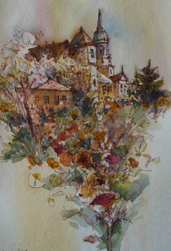
Moorea, French Polynesia
Moorea – Included are a recipe for bread and a sketch of the bouquet on our table.
I got elected to keep a journal of a trip to several islands in French Polynesia with 5 other artists in 1985. At the beginning I made the pages more writing and less drawing. That changed over the course of the trip. As is somewhat common, this sketchbook has a recipe included. Food has a way of creeping into my journals. 
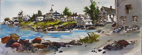
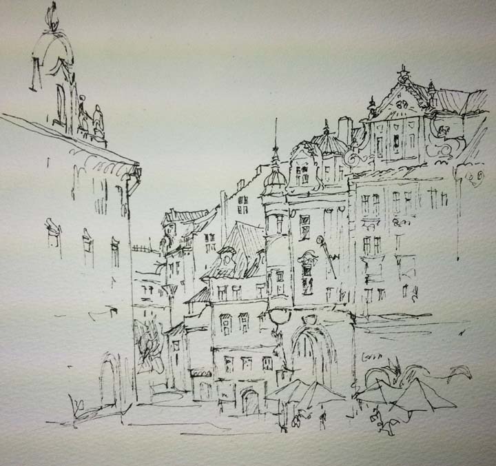
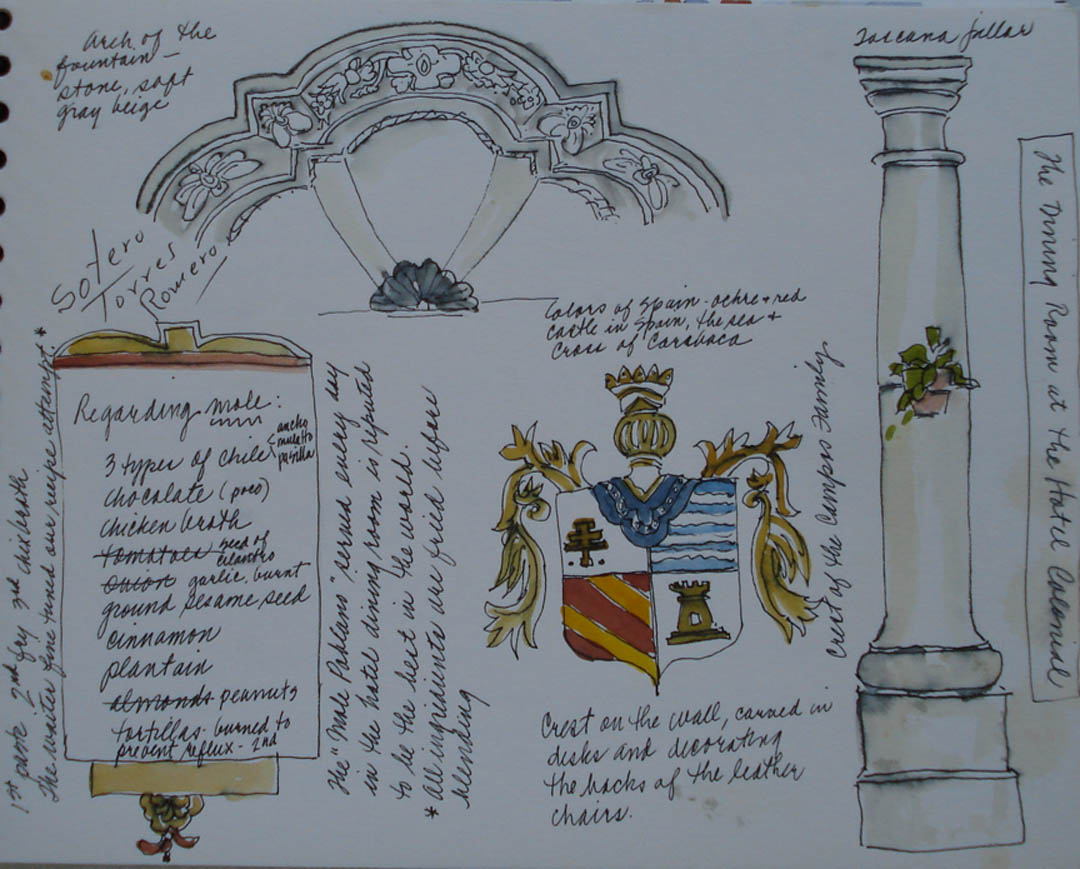
Barcelona, Spain
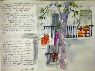
The Ramblas in  Barcelona was full of both images and information.                 
It was hot so my husband and I took shelter beneath the spreading trees on Las Ramblas and had a cold drink.  Several of the pages in this sketchbook were as a result of a stop to rest, get hydrated or other needs. We were in Barcelona for the Olympic Games in 1992. Most drawings are more like a snapshot than any sort of a complete watercolor sketch. I kept ticket stubs and have photos but this is my favorite way to remember. 
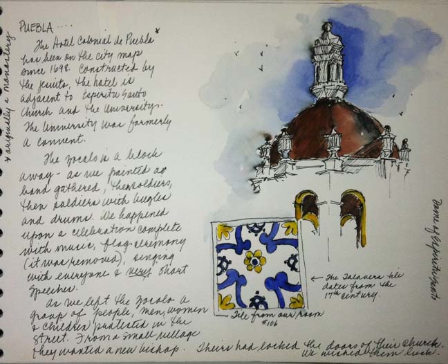
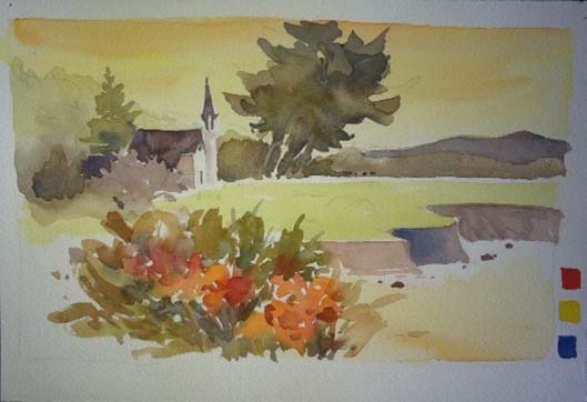
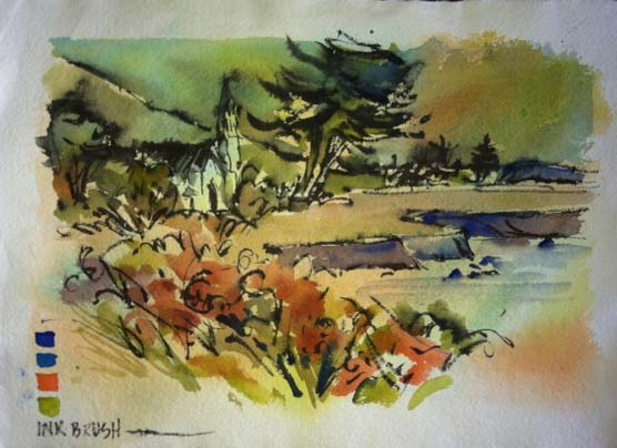
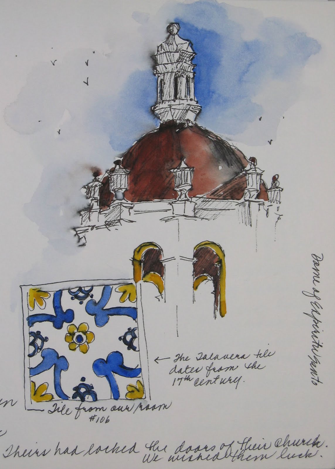
Mexico
The view from my room in Puebla – 2009
Sometimes just looking out the window is the prompt for a page in your journal. The bell tower and a Talavera tile from our room was enough for this page. Journals have room for interesting bits of information gathered along the way. There were a group of people from a small village sitting together in protest about their bishop. Apparently they had been locked out of there church and they wanted to be heard. I would have forgotten that had it not been for this journal. 
Tlaxcala is near Puebla and this was the second city we visited. 
The tile roof of the dome and negative space created by the building in the foreground were what interested me here. This page is more about that than the written part.
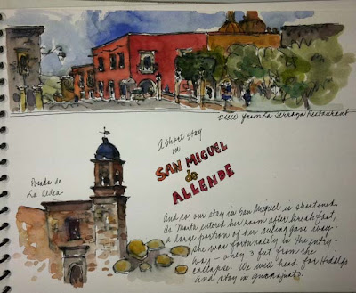
San Miguel Allende and the reason we left early
We left San Miguel early due to an accident in one of our hotel rooms. As my friend entered her room after breakfast, the door closing caused a portion of the ceiling to fall onto her bed. We cut our visit short to this city. 

Charleston, South Carolina
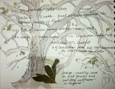
Spreading Live Oak tree and leaves
Most of my journals are done on trips with fellow artists or family. In this case it was a group from college in 2007 and I was one of eleven and the only artist. One of the group had a friend who did tours in Charleston so while he gave us history (the written part of this page), I drew the live oak tree which fascinated me. You have to be on the lookout for ways to keep your journal if you are with others who do not share your passion. 
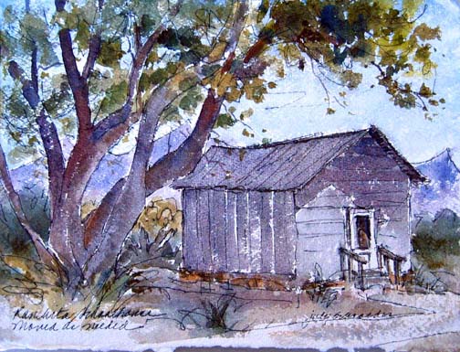
 Carpenteria, California
 
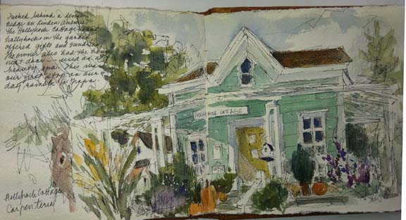
Hollyhock Cottage which has no hollyhocks
One double page from a watercolor journal kept on a 4-day ramble up the California coast to Napa in 2006. I was enroute to a workshop in Napa, CA with Brenda Swenson and we had the luxury of taking our sweet time on the trip. It amused me that the name of this building was Hollyhock Cottage when there were no hollyhocks in the garden.
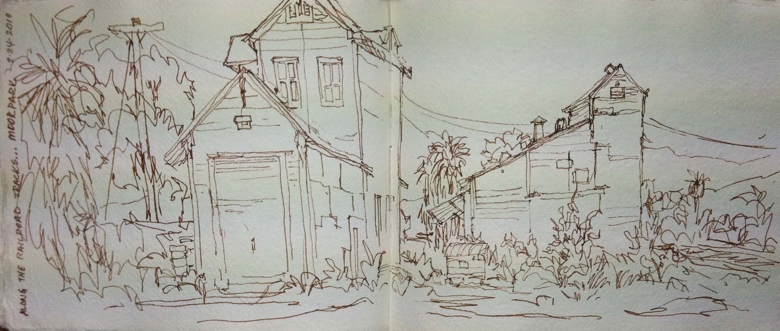
 North Carolina

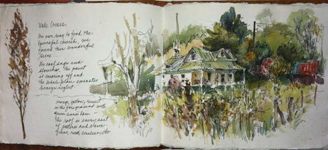
Valle Crucis NC Tin Roof
A trip to the northeast part of North Carolina in 2009 was a plunge into the world of green. This scene was an accidental find when we were on our way to find an historical Episcopal Church. We promptly settled down to get a sketch and were happy we lost our way. 

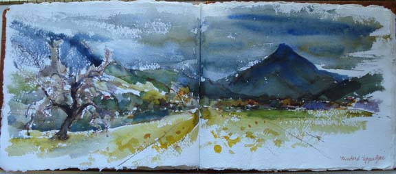
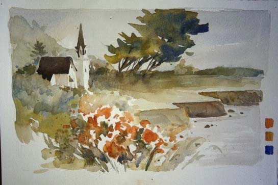
Upper Ojai, California
Stormy day and  brilliant mustard fields in Upper Ojai – 2011
Not much written on this page…it was done from the front seat of the car on a rainy, stormy day. That somber light was part of the reason that the mustard was so bright. The sketching trip with my friend Brenda Swenson turned into an exercise in painting in spite of the weather. We painted in the car, in our room and even in a mall. Now that is desperate! But then we do that. We’ve also painted in 110 degree heat. 

So the next time you go off to take a respite, grab a sketchbook. It can be mostly words, mostly drawings, mostly ephemera, or mostly photos. The method you use is a reflection of what interests you at that particular moment.
 

Experimenting with Color Combinations

Mendocino Church – Ink and Watercolor – 15″x22″

This painting was the prompt for several exercises in color combinations. I was experimenting mostly with versions of the primary triad. The one above was done with a full palette of color added after the initial ink brush drawing. It was done on site and I did not exaggerate the roses in the foreground. During the time I was painting the fog rolled in and out, the sun played peek-a-boo and things generally changed every few minutes. Some of that memory will be explored in the following paintings.

#1 – Ultramarine blue/yellow ochre/burnt sienna

Each of the study paintings were done in a small format – 7.5″x11″. When you are exploring it makes no sense to work in a large format. These are large enough to see what the color combinations can do but not so large as to be too time consuming. None of them are meant to be finished or to be presented for sale. They are just for my own use in teaching. The combination above is the one used by the California School painters when they worked on location. They are somewhat subdued.

#2 – Brights – Quinacridone coral/new gamboge/cobalt blue  

The brights used here create a very different feeling compared to the first example. I purposely left them in their hue, graying them only for the mountains in the background. Each sample took about 10 minutes. I drew and painted them quickly. Again, the purpose was to see what the limited palettes could do.

#3 – Quinacridone rose/quin. gold/ultramarine blue

The colors are cooler and the paint was applied wet into wet. The sky was dark making the forground plateau lighter. As the paper dried, the paint had a harder edge. Notice the pine tree behind the roof of the church.

#4 – Quinacridone gold/quinacridone magenta/indigo

This was the most surprising combination of all. I expected to dislike it and yet found I quite liked the tones it created. I left the color soft and light to emulate fog or early morning haze.

#5 – Scarlet lake/azo yellow/cobalt blue

Here is a different version of brights. No emphasis on the water here as it looks almost flat. By using the same subject and composition you can really evaluate the colors. I did some other small exercises with the emphasis on different elements such as the church, the pine trees, the water and cliffs, etc.

#6 – Quin gold/quin sienna/cerulean blue

A sequential series of washes was done before the images were painted. A full layer of each of the colors in the triad were put one after another while the former was still wet. If you use this technique be aware that the last color applied will be dominant. After the underpainting is completely dry, the rest is painted. You can also wipe out any area you want to be lighter before the underpainting is dry which will change it yet again.

#7 – Ultramarine blue/cobalt blue/permanent orange/green gold/black ink brush

In the initial painting, the ink was first. In this one, the ink was last but put on before the watercolor was absolutely dry. Different colors and different methods yield a completely different result.

Any series such as this can be very illuminating. All sorts of explorations can be done and by using an initial painting you have the advantage of having drawn it before. Each subsequent drawing will be easier and faster to do.

Watercolor Musings: In Defense of Drawing

Watercolor Musings: In Defense of Drawing: “I’ve always taken it for granted that artists drew from life, drew from other images, drew for fun, just plain drew and often! Seem…”

In Defense of Drawing

I’ve always taken it for granted that artists drew from life, drew from other images, drew for fun, just plain drew and often! Seems I was mistaken.
Recently an artist friend retired from her job as head of the art department of a community college in Southern California. I know her work and have been privileged to see her sketchbooks. Oh, this woman can draw and does so beautifully. She said the college had a very difficult time finding someone to replace her who could draw. Imagine that scenario in any other discipline. 
Puebla, Mexico – Church Bell Tower and Talavera Tile from my room
 Some teachers exhort their students to “just paint, you don’t need to know how to draw.” Others introduce them to the projectors where you can trace the subject matter from photos, drawings, etc. One projector ad boasts, “Stop wasting your creative time, draw accurately in minutes!” 
On the way home from a painting trip, we stopped in Moorpark CA for a last sketch.
Illustration artists have used a projector for work for many years but it was not considered appropriate for fine art. Their obligation to produce work exactly and in a very short timeline made it a wonderful tool. Then the fine artists began to use the projector to trace an image on their watercolor paper. There are several problems with this as a common practice. First, it limits your subject matter. Spacing stays pretty much the way it is in a photograph – any adjustment is difficult.  Secondly, the line quality is vastly different from a drawing done free hand. And ultimately it is not the same as an artist’s direct take on subject matter. The machine is inserted between the two. 
Prague Old Town Square
 Once a student brought his projector to class and basically challenged me to use it. So I did, using one of my own drawings to copy to a larger format. Usually drawing is meditative for me. It is one of the ways I slow down my life when it gets too frantic. As I drew, I found that tracing made my arm very heavy, I got tired and the line quality was boring. No thick and thin. No lifts and connections. Frankly, no fun. I can draw all day but suspect that tracing would only be comfortable for 30 minutes, max. 
Duomo and Leaning Tower, Pisa
 So…what is a person to do while their skills are developing? The answer is easy – you draw! Draw on napkins, draw on placements in restaurants, keep a small sketchbook in the car, your purse, somewhere nearby. There is no shortcut for competence, no easy street to get where you can draw anything, anywhere and joyfully. That ad encouraging you to “stop wasting your creative time” is misleading at best. How can time be wasted if you are skill-building and enjoying yourself? I know a woman who has been projecting for a decade…still at it. How well could she draw AND how quickly if she’d applied herself from the beginning. 
Disneyland’s Casey Junior Railroad Decoration
 Graphoanalysis is the study of handwriting, or brain-writing, as the professionals sometimes call it. The essence of “you” is divulged in your penmanship. What else is drawing but brain-drawing? We each have our own special approach and special marks. What an exciting adventure for all artists to find that and perfect it! 
Part of a float for Pasadena’s New Year’s Parade
 My painting buddy, Brenda Swenson, has a sketch challenge on her blog site: http://brendaswenson.blogspot.com/  In the search box just type “challenge” and you’ll find posts regarding this wonderful way to build confidence and competence in drawing. Check out the post,  “artistic license,” to find the photos of those who have taken her 75 day challenge and earned their own license. There are guidelines on her site. Do yourself a huge favor and accept the challenge!
Happy Drawing!
 

Watercolor Musings: Doing a Series

Watercolor Musings: Doing a Series: “Shortly after I opened the gallery in 1998, I found I needed to take a break and go ‘paint-about.’ I was planning on visiting my sister in C…”

Doing a Series

Shortly after I opened the gallery in 1998, I found I needed to take a break and go “paint-about.” I was planning on visiting my sister in Central California and needed a goal so I would use my time away carefully. Since we have now 4 generations of teachers in my family I decided to do early schoolhouses. My grandfather was a headmaster of schools in Maine before moving to California, my three great-aunts went to Normal School and then taught and my mother taught in a two teacher school for her first assignment.
The project continues and I have collected, artistically, many tangible examples of early California and observed the affection that the communities had for these important structures. They served not only as places of learning but also gathering places for voting, civic events and other purposes. Here are a few examples:

Encinitas, CA

The schoolhouse was built in 1883 and has been moved at least once. It’s very near the beach so sea sponges were used to clean the blackboards. The building is now used by the Encinitas Historical Society.

Indio, CA

Located in the desert, the architecture of this building included wide eaves for shade. By doing a general series such as this, I was able to observe changes in style according to the weather in certain regions. Also I’m convinced that some plans were shared. I saw one plan done on linen which was one of the more common styles of building.

Fallsvale, CA

Located in the mountains, the pitch of the roof is a clear indication that snow falls here! The logs were used with the bark still intact although it is now coming off. The building now is used as a community center.

Ranchita, CA

Looking more like a shed than a schoolhouse, Ranchita’s school had windows on only one side which was necessary for stability. Located just outside Anza Borrego Desert, the schoolhouse served the miner’s families. Because the schoolhouse was not used in one particular area, it was outfitted with skis so it could be moved as needed. I drew the side without windows to emphasize the unique structure.

The “hunt” for the schoolhouses has been a real treat and since the paintings are small I can do one quickly. Learning a bit about the history of the school and the area makes it all more interesting.

Watercolor Musings: Sketchbooks

Watercolor Musings: Sketchbooks: “Savory Cafe & Bakery, Ventura California I still remember the first time I took a sketchbook into a restaurant AND used it. I was attend…”

Sketchbooks

Savory Cafe & Bakery, Ventura California

I still remember the first time I took a sketchbook into a restaurant AND used it. I was attending a workshop in Oaxaca, Mexico in 1998 and a group of us went to dinner together. We all took our sketchbooks and drew while we waited for dinner to be served. I found it to be such a liberating feeling! I now think nothing of it but still try to be sensitive to my companions. I don’t want to appear disinterested in the chatter even though when I look at the sketch later I can perfectly recall the conversation as well as the speaker’s voice. My family is indulgent and don’t mind my idiosyncrasies.

In the sketch above, I drew part of the ample bakery counter and on the right, I drew my lunch. I ordered those french fries because they came in the stiff paper cone which was wonderful to draw. (OK, they were lovely to eat, too.) Last March I visited the cafe again and sat in just about the same spot. It was immediately apparent that the place had changed hands. Most of that sense was fueled by the change in the set up and feeling of the place. I wouldn’t have been so aware had I not drawn it two years earlier.

High Sierra Cafe, Lone Pine CA                  

At the Savory Cafe I was with a painter friend while at the High Sierra Cafe, I was alone. In this case, my sketchbook became a companion of sorts. I drew the flowers on my table as I waited for my breakfast. I was in Lone Pine for the Annual Manzanar Workshop begun my Henry Fukuhara. I’m glad I did this sketch instead of reading the paper. I have a tangible memory of that morning.

So, why sketch other than to hone your skills?
• It makes time scamper! I am a much more patient person if I can draw while I wait. When my children were in school, I drew on the backs of PTA agendas and  paper menus as well as sketchbooks. I did dozens and dozens of drawings of coffee carafes, stryfoam cups, spoons, napkins etc. In airports, I sketch fellow travelers but always keep my dark glasses on…that way my staring at people is not so obvious.
• Your memories will be greatly enhanced. Drawings can evoke smells, conversations, and even emotions. In my sketch of he cafe, I know not only what my sandwich looked like but also what was in it.

Hotel Colonial Dining Room, Puebla, Mexico

• Authencity. When I taught my first journal-keeping class, my students used authentic as word to describe the results of their combination of drawings, narratives and photographs. I can open any one of my numerous sketchbooks and remember exactly where I was, who was with me and what we were doing. Photographs alone have no such punch. The multiple drawings on one page above were done over several days while I stayed with two other artists at the Hotel Colonial in Puebla. Different interesting features were apparent as we were seated at different tables. Often food interests find their way into my sketchbooks. We were trying to figure out the ingredients for mole for which our dining room was famous…when we showed the list to our waiter, he made some corrections and signed my book!

For all of these reasons and more, artists prize their sketchbooks above their paintings. Because they are not meant for public view and sale, they are more personal. I am often asked if I sell my sketchbooks…the answer is always the same…nope.

More Explorations with Ink and Watercolor

I have to admit that the element of design that most speaks to me is line. I love the quote that says “drawing is taking a line for a walk'” although I prefer thinking of it as a dance! My fascination with ink and watercolor is long term and I enjoy playing with all the possibilities. The image selected for this blog came from a barge trip from Prague to Berlin in 2008. We had a very brief time in Torgau on the Elbe River so I only got photos. The town is most well-known as the place where during the Second World War, the US Army forces coming from the west met with forces of the Soviet Union coming from the east during the invasion of Germany on April 25, 1945.
Since I’d had no time to draw on site, I sketched from the image on my camera after returning to the boat. From that drawing, I created the other versions after returning home, each using a different pen or watercolor and/or paper. I like to replicate the same image for teaching for two important reasons. First, I can re-draw each one with increasing speed since it is familiar territory and secondly, my students focus on the lesson without being distracted with different subject matter each time.
I’ve included the photo reference, initial drawing in a small sketchbook and subsequent explorations with various tools and applications, the most recent being 24 hours ago.

Photo reference – I crouched down on the path so I could get the sharp angle with the roses in the foreground. My drawing is fairly detailed in the blooms on the drawing but much less so in the drawing/watercolors.

Sketchbook drawing – The sketchbook is 5 1/2″ x 11″ when open. I’ve been surprised to be able to get drawings from the camera and it helps in future work.

Torgau#1 – The drawing was first and done with a permanent black pitt pen. The underpainting was added next followed up with watercolor, loosely applied. No movement of ink here!

Torgau#2 – Underpainting came first here since I drew with the pentel color brush in sepia which is water soluble. Watercolor was added and since I’d lost the white with the underpainting I added white gouache for the roses, etc.

Torgau#3 – Pentel color brush in sepia was used here and I added hydrus liquid watercolor to the line drawing. The smoother paper makes the watercolor sit on top and perhaps the liquid watercolor too. I’ve only experimented a bit with it so I have lots to do yet. The watercolor didn’t move as much as I thought it would, but then again with my inexperience it may be “operator error” and not the medium at all.

Torgau#4 – Underpainting was done first with a line drawing done with a stabilo brown pt. 88 pen which is water-soluble. The first step after the drawing was a wet brush over the line to establish a value pattern. Then watercolor was applied, more drawing, more watercolor and finally white gouache.

My painting buddy, Brenda Swenson and I are always on the lookout for new and interesting tools, especially ink pens and brushes. It’s thanks to her that I have the stabilo pens which I am going to love using! At the end of yesterday, after exploring with this new pen I was energized in spite of a having cold and fatigue from a large family party at my home two days prior. That’s about as good a recommendation for this sort of activity as I could make.

Watercolor Musings: More Explorations with Ink and Watercolor

Watercolor Musings: More Explorations with Ink and Watercolor: “I have to admit that the element of design that most speaks to me is line. I love the quote that says ‘drawing is taking a line for a walk”…”

Watercolor Musings: No Excuses Travel Set – Part II

Watercolor Musings: No Excuses Travel Set – Part II: “In an earlier blog, I described the small palette made of an altoids tin and empty palette pans filled by colors of my choice. Recently I wa…”